UI Component Diagrams
A UI Component diagram answers a question front-end teams and architects ask all the time: what is the whole user interface of this application made of, and which parts are shared?
Pick an application and ArchRepo draws every UI Component inside it as a tree of nested boxes — the screens, the sections of those screens, and the widgets inside those sections — however many levels deep the model goes.
What the Diagram Shows
The application you chose is the title. Its UI Components sit below it. A UI Component that holds other UI Components is drawn as a larger box with its contents inside it; a component that holds nothing is a plain card.
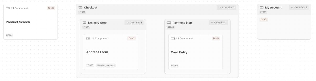
Every card shows the component’s name and reference. Cards and collapsed boxes also show the component’s status; an expanded box does not. Select a card to open that UI Component’s page.
The diagram is read-only, and it has no lines. Nesting is the relationship: a box inside another box is held by it. You change the picture by changing the model behind it.
The Whole Tree, Not Just the Top Level
This diagram shows the application’s UI Components at every depth. The Application diagram is different: its UI Components layer shows only the components the application holds directly, and does not show anything nested inside them.
Use the Application diagram for a quick view of an application’s main UI Components. Use this one when you need what is inside them.
A UI Component in Several Containers
A UI Component can be held by more than one container — an Address Form might be part of both a delivery step and a saved-addresses page. The diagram still draws it once:
- It is drawn under the container closest to the application. If two containers are equally close, the one whose reference comes first wins.
- Its card then shows how many other containers in this application also hold it: Also in 2 others.
- A component held by exactly one container has no badge.
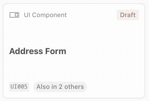
The badge counts the others, not the total. A component held by three containers shows 2: one container is the one it is drawn in, and the badge counts the rest. Without the badge you could read the tree as a complete list of what each container holds. It is not — a shared component appears under only one of its containers.
Controls
- Application selector — on the project’s Diagrams tab, choose which application to show. Only applications are listed.
- Contains N — every box that holds other UI Components has this button in its header. All boxes start collapsed; select the button to expand one, and again to collapse it.
N is the number of components drawn directly inside that box — not everything beneath it. A box showing Contains 2 may have many more components several levels down. A component that is drawn under a different container (see above) is not counted for the others. The button is greyed out when nothing is drawn inside.
Which boxes are expanded is held in the page address, so sharing the link shows the same view, and your browser’s Back button steps through your changes.
Where to Find It
Across the project — the project’s Diagrams tab, then UI Components in the switcher. Choose an application.
From an Application diagram — the View UI components button beside the application’s title opens this diagram already focused on that application.
The button appears only when the application has at least one direct UI Component — one the application itself contains. An application whose UI Components all sit inside other UI Components, with none held directly, does not show the button.
When the Diagram Is Empty
| What you see | What it means |
|---|---|
| ”Choose an application above to see its UI Components.” | No application is selected yet. |
| A grey placeholder where the diagram should be | The diagram is loading. |
| ”This item is a UI Component, not an application…” | The page address points at a UI Component. Choose an application in the selector. |
| ”This item cannot be shown here…” | The item chosen has been deleted or archived, belongs to a different project, is not an application, or you no longer have access to the project. |
| ”This application contains no UI Components. Archived or deleted UI Components are not shown.” | The application has no UI Components to draw. See below. |
| ”Failed to load the UI Components diagram.” | The diagram could not be retrieved. Reload the page. Your model is not affected. |
The last two look similar but have different causes: one is an empty model, the other is a failed load.
Why Is My Diagram Empty?
The diagram is built from what is recorded in the model, so the usual cause is that the nesting has not been recorded yet. There are three things to check.
1. The application contains its UI Components. The diagram starts from an Application and follows contains relationships down to UI Components. Record that the application contains each of its top-level UI Components.
2. UI Components contain the UI Components inside them. For deeper levels, open the outer UI Component and record the UI Components it contains, in its UI Components section under Assembly. A UI Component appears only if it can be reached from the application by following contains relationships downwards — directly, or through other UI Components at any depth.
Record containment on the container, not the contents. A UI Component recorded as containing the component that actually holds it is nested the wrong way round, and ArchRepo does not correct it — the diagram draws exactly what was recorded. If a component is missing or sits at the wrong level, check that the relationship was recorded on the outer component.
3. The items are active. This diagram leaves out anything whose status is Deleted, Archived or Rejected. No amount of editing relationships fixes this, and the result is identical to an empty model:
- An archived application shows “This item cannot be shown here…”.
- An application whose UI Components are all archived shows “This application contains no UI Components”.
- Anything reachable only through an archived UI Component disappears with it.
If the model looks right, check the status of the application and of its UI Components.
Why It Is Useful
Seeing the full front-end scope. Every screen, section and widget an application needs, in one tree, drawn from the model rather than kept in a separate document.
Spotting reuse. An Also in N others badge marks a component that several parts of the application depend on. Changing it changes them all.
Finding gaps in your own design. An application with UI Components recorded but no nesting, or a screen with nothing inside it, is a prompt to go back and finish the model.